It would appear Starbucks is more than just a coffee shop

Recently, I was sitting at a Starbucks working on an essay. Stuck for a topic,  I was starring off into space, or actually at my Starbucks cup. As I wandered further and further away from my essay topic, I began to wonder how the Starbucks logo came into play, and why, even though it is so basic and simple, it works so well.


I decided to pull out the C-R-A-P principles out of my back pocket and investigate.


First of all, the contrast is clear. It is a green and black logo, with a white background. The green and black are very deep, dark colors, and the white is a stark white.


Repetition is also involved in the logo design, as the hair on the lady and the lines surrounding her are all similar and repetitive.


Alignment is used well here, as everything is symmetrical.


Finally, proximity is included as everything inside the logo is very close together, especially how the logo itself is small.


I also wondered a bit about the history of the Starbucks logo, and here is what I found according to Cracked.com:


“The Symbol Is Used For: A classy-looking figure to put on the coffee chain’s sign and cups. But the Symbol Actually Means: Obsession, addiction and death.

If you’re familiar with the Starbucks logo, it’s probably because, statistically, you are inside a Starbucks right now. If you’re not familiar with Starbucks, that’s because you’re a hypothetical person created just so we could give this paragraph a satisfying structure.

Either way, you may not have realized that the woman in their green label with the perky breasts and weird twin-fishtail deal going on is a siren from Greek mythology.”


I found that pretty interesting. And seeing how those who do enjoy coffee, Starbucks in particular, seem addicted to say the least, their logo is working for their company for a lot of difference reasons.  


Image

Life of Photoshop

Recently, I watched the movie Life of Pi. Not paying much attention to movie awards or critic’s reviews, for the most part, I log onto Empire Theatres’ website and see what movies catch my eye. Of course, when I saw the Life of Pi poster, it truly did grab my attention. For one, the colors in the advertisement were beautiful. They were bright and vibrant, yet they had some pastel colors incorporated, which made for an excellent contrast. Two, it looked real. I am not sure if they really took the picture for the movie poster with the tiger sitting in the small row boat with the boy or not (I’m guessing not haha ), however for me, as edited or Photoshopped as the image would be, it looked flawless.


This made the poster seem that much more realistic to me. If there had been bad Photoshop smudging or a bad cut from too much of the eraser tool, the entire poster would have been different.


And as simple as it sounds to just “not mess up” in Photoshop, especially considering these people making the images/designs are professionals, as we’ve all come to realize, everyday in magazines and advertisements, there are huge Photoshop/editing mistakes made.


So, I want to thank the professionals working on the Life of Pi posters/designs, as you’ve obviously done your job extremely well.


And I was glad I was able to pick up on some of the tools on an editing program that could have been used, and see the potential they have to make or break the look of the images I see everyday.


Image


Shannon Kerr

The difference between Photoshop and InDesign

I have always wondered what the difference between Photoshop and InDesign was. Since I knew little to nothing about both, I felt like they were practically identical, and both extremely hard to use.  However, in recent weeks, since I began using both programs more and more for class, I inquired what exactly differentiates the two. After someone explained to me that they are both in fact owned by the same company, Adobe Systems, here is what some classmates had to say that explained the differences pretty well for me:


-Photoshop can make vector images.

-Photoshop can be used for editing pixel-based images

-Photoshop can be a graphics editor

Whereas:

 -InDesign can be used for editing and also considered a graphics editor

-InDesign can organize text/images

-InDesign can design layouts (useful for newsletters/ magazine pages)


They also explained that it is likely as a graphic designer, you would use Photoshop to edit a picture, and then use InDesign to create the whole layout. Sort of like Photoshop is the tile you are designing, and InDesign is the concrete floor you are laying it on with other things such as nails, glue, etc.

 (That comparison was a bit of a stretch, I know).

Anyways, I hope that clears up any questions about the differences between the two. And thanks to the folks who helped me become a better carpenter.


-Shannon Kerr

The Improvements with Photoshop

Photoshop and I haven’t always had the best relationship. Always struggling with the tools and tricks, I thought it was never going to get better. However, after completing the creative brief and design it forced me to learn the ways of Photoshop, and become somewhat better with my creative design side. I started out not knowing the eye dropper tool from the polygonal lasso tool, however, after working for hours on the projects that we’ve completed, I am finally able to say I have found my way around the tools panel. I even started using different ones like the ellipses tool and the selections tools. It is safe to say I am not going to be a pro anytime soon, but having the extra bit of confidence going into my first co-op work term knowing that if someone asked me to make a simple design concept  I could do it, really helps.


Since I have been feeling more comfortable around Photoshop, I was even able to use it to complete other projects for different courses. Which, before this class, I would have thrown something together on paint.  


I look forward to improving my skills even more, and luckily some classmates even let me in on the secret of YouTube tutorials. I have been watching them ever since, learning some cools shortcuts and more. For anyone who has yet to check ‘em out, I encourage you to go now!


–       Shannon Kerr

Elegance achieved through web design

Image


I decided to look at my friends company Elegant Productions and its website. Sense this is still a new company her website design is still very up-to-date yet elegant. The main colour throughout the website is purple. I believe they chose purple to represent there company as in royalty or elegance. Their logo is on every page as well as a swirly flower accent on each page. I think they have done a great job at branding their company through the colour choices they have made.

They also use a font that looks like cursive writing, I think this helps into making their brand be represented as elegant in all aspects. In their about us page they talk about how they pay close attention to the biggest details right down to the smallest and I feel this is even shown through their website as the smallest details are still designed with an elegant flair.

I think they did a great job at representing who they are and what skills they obtain just through their website design.

Here is their website, check it out :http://elegantproductions.ca/

-Emily L


Clever Movie Posters

http://www.buzzfeed.com/awesomer/24-unofficial-movie-posters-that-are-better-than-the-real-po

The link above contains what it calls “Unofficial Movie Posters that are better than the real posters”.

Most of them are pretty good but a few of them I think are great and they tend to be ones that make use of negative/positive space or symbols in the image.

ironman3

Iron Man 3 – I thought this was neat because of the three lines indicating action as he is flying upwards but also doubles to mean “III”.

dirtyharry

Dirty Harry – great use of perspective.

seven

Seven – see the 7?

Those are just a few of the ones I liked but I think others like the Lion King, the Goonies and the Amazing Spiderman are also pretty neat.

It’s interesting how most movies do tend to have these alternative posters for them that are almost always more creative and interested than their promoting counterparts. Understandably, most movie posters want to emphasize the actors in the movie by using an image with them in it and Hollywood probably underestimates (rightfully so perhaps?) the average person’s capabilities of deciphering these types of posters and would rather go for something easier to digest.

Personal Branding and Online Presence

I have a blog. I’ve had one for quite a few years now. One of the biggest problems with having a blog, for me, was trying to pinpoint it down to just one subject – which I have never been able to do. Little did I realize until fairly recently that another thing I need to focus on is the actual branding aspect of it. Then it occurred to me. Anyone who has any sort of an online presence has to focus on their own personal branding.

That last line is something I’ve always sort of realized. Just in the sense of controlling how you want to be perceived. Yet I never really considered it to be a type of “branding” until nowish. And with so many social networking outlets that are all pretty much connected in some way, there’s plenty of opportunity to create an online presence… and plenty of opportunity to screw it up.

So starting with Facebook. The people you’re friends with will see you a certain way based on how you use Facebook. What type of statuses you post: personal, news release, entertainment, gossip, complain, etc. How open or private your Facebook is also influences the type of statuses you may post. Twitter is typically more open and public so what you post on Twitter may differ from Facebook. Then of course there is Tumblr, Instagram, Pinterest, Google+, LinkedIn, WordPress, and a bunch of others. The question now is: how connected do you want each of these to be?

Each method of social media serves a different purpose, both in how we present ourselves and in how we use it to interact with other people. But I think there still should probably be some level of connection between them all. LinkedIn is meant to be the most professional of the social networking sites, since that’s what its primary purpose is. But if someone goes from your LinkedIn account to your Twitter to your blog to your Facebook and gradually sees a huge change in presentation between them, it will likely lead to some confusion. How authentic is this person and which profile is more true to the type of person they are?

I guess the point of all of this comes down to whether we want or should put more effort into personal branding across our entire spectrum of social networking and online presence. For me, that has included interconnectivity between the different sites which all lead to or from my website but beyond that, it could also mean things like images and colours, photos, whether I want to create some sort of a logo, and probably most importantly, content.

Pepsi

Sense I looked at pieces to do with where mom works, I thought I would also look at material from where my dad which is at Pepsi.

Even thought this ad isn’t in English, I thought the design and layout was interesting. Clearly in this ad they chose to go with sex appeal by using a nice looking lady. However there is more to the ad the just the pretty face.

The way her body is turned facing the text along with the straw the directly points to the text was placed there on purpose as a leading line to lead the viewer to read more. Another leading line is the Pepsi logo on the can leads the viewer to the logo below the text. I also consider this to be repetition.

When you look to the bottom of the ad there are also leading lines to the last bit of text on the page. This time they are using the models fingers with the red nail polish to point over. Also her elbow directs you to the text at the bottom of the page.  Even though this is subtle I still felt that it was effective.

I think there was a great use of the space, but also left plenty of white space to make sure the ad would not be over crowded.  Overall the colour choices were repetitive with what colours the company use, such as the models dress, the background, red lipstick and the red nail polish. I think this ad would be effective sense they use so many leading lines to direct viewers to the text.

-Emily LImage

How images and colour influences your brand

Image

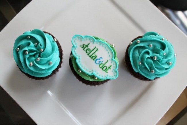
In the past few months I have become more familiar with the jewellery company stella & dot. The business itself functions a lot like the makeup company Mary Kay. Sale associates receive products each month and can sell door-to-door or host parties with friends in order to sell some amazing pieces. I really love how the colour turquoise is used throughout their product line and promotional materials. It keeps their items looking consistant and well put together.

Image

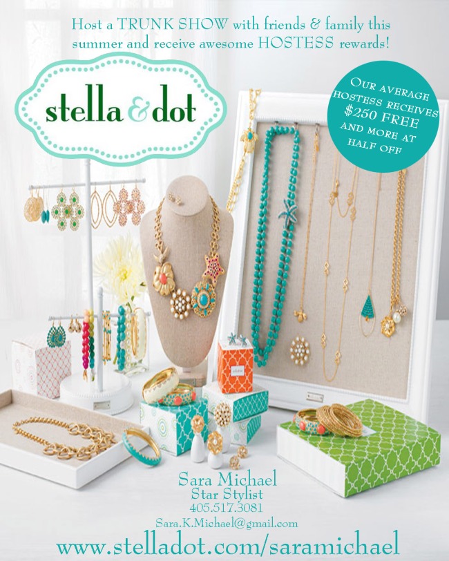
Here is an example of an ad that the company used on their website. Again the type face and colour scheme is consistant with the stella & dot brand. Clean, girly and well put together in my eyes. The jewellery itself sticks out from the calm background, and complementary colours are used throughout the advertisement. I also love the added pops of colour on the packaging, which makes the overall look even more fun.

Just looking at stella & dot’s promotional material like it’s website, advertisements and Facebook page makes me want to learn more about the company and the products that they sell. I am finding more often now when I ask people where they got their lovely jewellery, stella & dot is the answer! We have learned a lot this term about what works and doesn’t work when brands are trying to promote their business. I find stella & dot have created a brand that is consistant, girly, yet sophisticated all at the same time. ImageEmma Pace

Room Colouring

Image

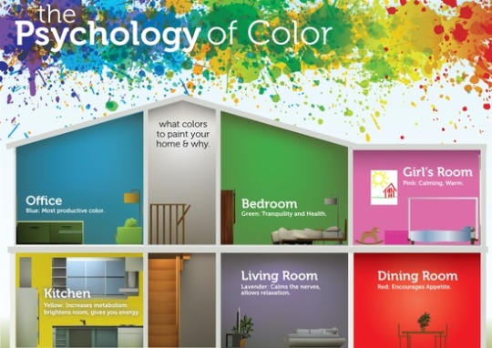
I find a lot of us are getting inspiration off of Pinterest, and I did too! I stumbled across this one day as I was going through the millions of pins featured on the site. I think it is interesting to look at the vibes that certain colours give off. I am all about how certain settings influences peoples moods, and I think this diagram provides perfect explanations!

So where would you want to be most productive? Probably your office and I think its cool how blue is considered the most productive colour. All of us are going into co-ops this summer and although we cannot paint our employer’s offices blue, you could incorporate it into your clothing, writing materials, computer backgrounds, etc.

I have always thought green symbolizes tranquility and health because when I think of green I think of nature. If I were to paint my bedroom green it would have to be a lighter version than the one pictured above because I find it just a little too vibrant.

Its funny in this diagram how they tell you to paint your kitchen yellow because I have often heard that light shades of yellow has the same effect as green, calming. However I guess since they are using such a bright shade in this diagram, painting your kitchen space that yellow probably would keep you awake.

I find painting a girl’s room pink is very stereotypical, but I am open to it. I like the idea of the living room being darker, allowing you to relax and unwind. Its funny how the colour red symbolizes increasing your appetite, but I do not think I would ever want my dinning room to be that colour!

Do you guys find colour influences your mood? I think it is interesting that the shades that exist in our backgrounds can have such an effect on us!

Emma